‘Greenery’ Is the 2017 Color of the Year
As 2016 comes to a close, so do the colors Rose Quartz and Serenity. Earlier this month, forecasters at the Pantone Color Institute declared that “Greenery,” a fresh and zesty yellow-green shade, is the color of 2017.
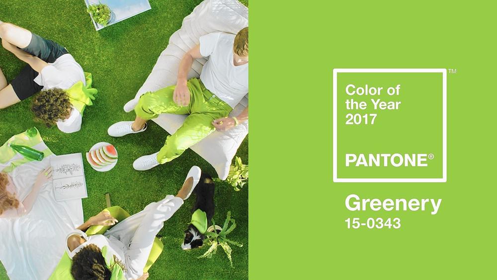
The Pantone Color Intitute has chosen “Greenery,” a zesty yellow-green, as it color of the year for 2017. (Photo: Pantone)
Every year, the global color authority chooses a new shade to shine in fashion, home décor and more. The Pantone color of the year is a color snapshot of what the company’s executives see taking place in global culture that serves as an expression of a mood and an attitude.
“Greenery” is nature’s neutral, Pantone said. Illustrative of flourishing foliage and the lushness of the great outdoors, the attributes of “Greenery” signals consumers to take a deep breath, oxygenate and reinvigorate.
“Greenery bursts forth in 2017 to provide us with the reassurance we yearn for amid a tumultuous social and political environment,” said Leatrice Eiseman, Pantone’s executive director. “Satisfying our growing desire to rejuvenate and revitalize, Greenery symbolizes the reconnection we seek with nature, one another and a larger purpose.”
Pantone called the color a “life-affirming shade” and said it was “emblematic of the pursuit of personal passions and vitality.”

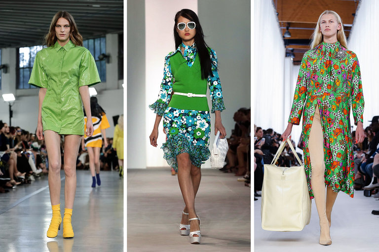
“Greenery” showed up in mens fashion on the spring 2017 in the Robert Geller (l to r), Prada and Gucci collections.
(Photos: Firstview/Getty/Firstview)
Although there is green in grass, leaves and apples, Pantone is specific about what counts as “Greenery” (#15-0343), which the company said “evokes the first days of spring when nature’s greens revive, restore and renew.”
“It’s the green that signals vitality, energy and warmth from the sun,” said Laurie Pressman, Pantone’s vice president. It was picked because it represents rebirth and regeneration, she said, adding the hue is symbolic of “where we are in our lives and what we desire. We are so submerged in our routines and tethered to devices, but we have a great desire to disconnect and replenish.”
The company’s team around the world spends the year studying trends in fashion, consumer products, social media and technology. It looks for influences that best describe the current mood of society and picks a color to reflect those elements.
Sometimes more than one color makes sense. Pantone picked a baby blue and a dusky pink for 2016 reflecting the gender-bending move toward “equality and fluidity” taking place across society and fashion. The company called them “welcoming colors that fulfill our yearning for reassurance and security.”
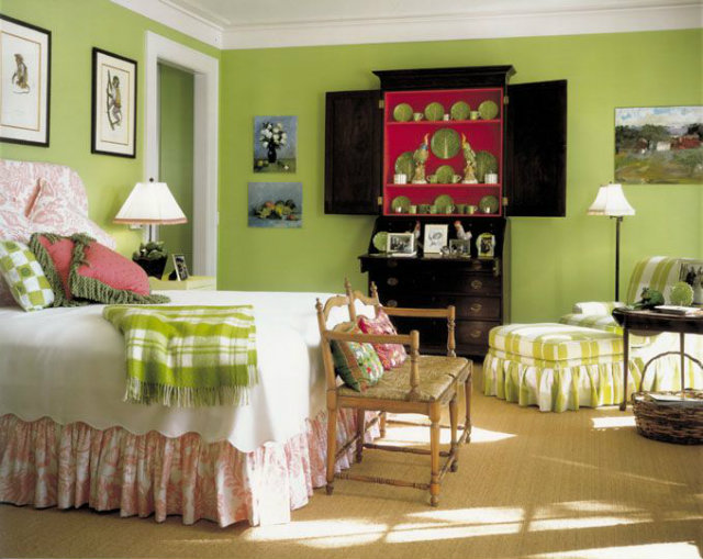
“Greenery” will also show up in home fashions next year. (Photo: Koket)
When the Pantone team started noticing the creeping preponderance of green, there was a sense that perhaps it reflected what was regarded earlier this fall as the possibility of a new beginning with the first female president. But in the wake of Donald Trump’s victory and the dissension it highlighted, Eiseman said, green “could have an even more significant meaning.”
“We know what kind of world we are living in: one that is very stressful and very tense,” she said. “This is the color of hopefulness, and of our connection to nature. It speaks to what we call the ‘re’ words: regenerate, refresh, revitalize, renew. Every spring we enter a new cycle and new shoots come from the ground. It is something life affirming to look forward to.”
In other words, if 2016 sucked, whether because of elections or market forces or because you were suckered by fake news on Facebook, this suggests the possibility of something different in 2017. It contains the promise that we can all start afresh.
The shade of green also represents a growing movement around protecting nature. “We’re more conscious about the environment and protecting the planet,” said Pressman.
“Greenery” is a versatile “trans-seasonal” shade that lends itself to many color combinations. Along with the unveiling of the color of the year, Pantone created a selection of 10 palettes pairing “Greenery” with neutrals, pastels, brights, deeper tones, metallics and even the two 2016 colors of the year. The colors easily cross over fashion, beauty, product and graphic design applications.
“Greenery” showed up on the spring 2017 runways of Emilio Pucci l to r), Michael Kors and Balenciaga to name a few.
(Photo: New York Times)
This year, the Pantone people started noticing leaf green. There was leaf green on the runway, for example, starting in about the fall 2014 shows and building through spring 2017, when brands like Balenciaga, Gucci, Michael Kors, Kenzo, Zac Posen, Cynthia Rowley and Prada (to name a few) all featured it to varying extents. Actress Julianne Moore wore leaf green Givenchy to the 2016 Screen Actors Guild awards, and Hillary Clinton wore it on the campaign trail. (Although the only “Greenery” that President-Elect Trump appears to like is on his money.)
Tech companies like using leaf green in their offices. The Cité de la Mode et du Design, which houses the French Institute of Fashion, features a transparent walkway, lit in leaf green, visible from the Seine. Matcha tea is hot. And the “Greenery” shade appeared on the new Mercedes-AMG GT Roadster and Skoda car models this year. Green walls are becoming architectural staples in the form of vertical gardens, and green juice is everywhere. The Green Party is growing in prominence. Dr. Strange wears a green amulet known as the eye of Agamotto. Dior’s new makeup colors include a lip shade called “clover.” Now with it as the chosen color of the year, brands will also want to get in on the trend with their packaging and products, from handbags to jewelry and housewares.

The new 2018 Mercedes AMG GT R in exclusive Green Hell Magno . (Photo: Mercedes-Benz)
“There’s a Japanese concept called ‘forest bathing,’ which says that when you are feeling stressed, one of the best things to do is go walk in the forest,” Eiseman said. “But if you can’t do that, what can you do? Bring green into your environment. Put in on your body, or in your house or near your desk. That symbolic message is very important.”
And if you aren’t in love with the color yet, the seeds have been planted. It’ll grow on you. Just wait until the end of 2017.